Unveiling our New Logo: A Symbol of Care and Innovation
Change is a constant in the world of healthcare, and we strive to continually enhance our services and innovate while continuing to care for the local community that have trusted us with their health since 1996.
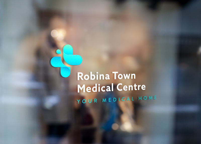
We’re excited to introduce a brand new logo for our medical practices.
This isn’t just about changing a look, it’s a representation of our commitment to the wellbeing of the local community and our dedication to staying at the forefront of medical care here on the Gold Coast.

Our Butterfly
Our new logo carries a symbolism that encapsulates our values and mission.
Butterflies show us how we can go within ourselves to dissolve old forms and morph, rebuilding and evolving ourselves, as part of the essential process of growth and renewal.
Approachability, softness and caring are all qualities that are essential when helping patients at their most vulnerable.
Our vibrant aqua colour signifies vitality, reflecting the transformative power of healthcare in people’s lives.

The Heart of Our Practice
At the heart of our practice is you – our valued patients. Our new logo is a reminder that you are the focus of everything we do. Just as the different elements of the logo come together harmoniously, so too do our efforts to tailor care to your individual needs.
A New Chapter
This new look marks the beginning of an exciting chapter in our journey together. It’s a symbol of progress, a testament to our growth, and a visual representation of the exceptional care you can continue to expect from Robina Town and Easy T Medical Centre. As we move forward, our refreshed brand serves as a constant reminder that we’re here to support your health and wellbeing every step of the way.
Thankyou for trusting us with your care and we look forward to welcoming you to Robina Town or Easy T Medical Centre for all of your healthcare needs.